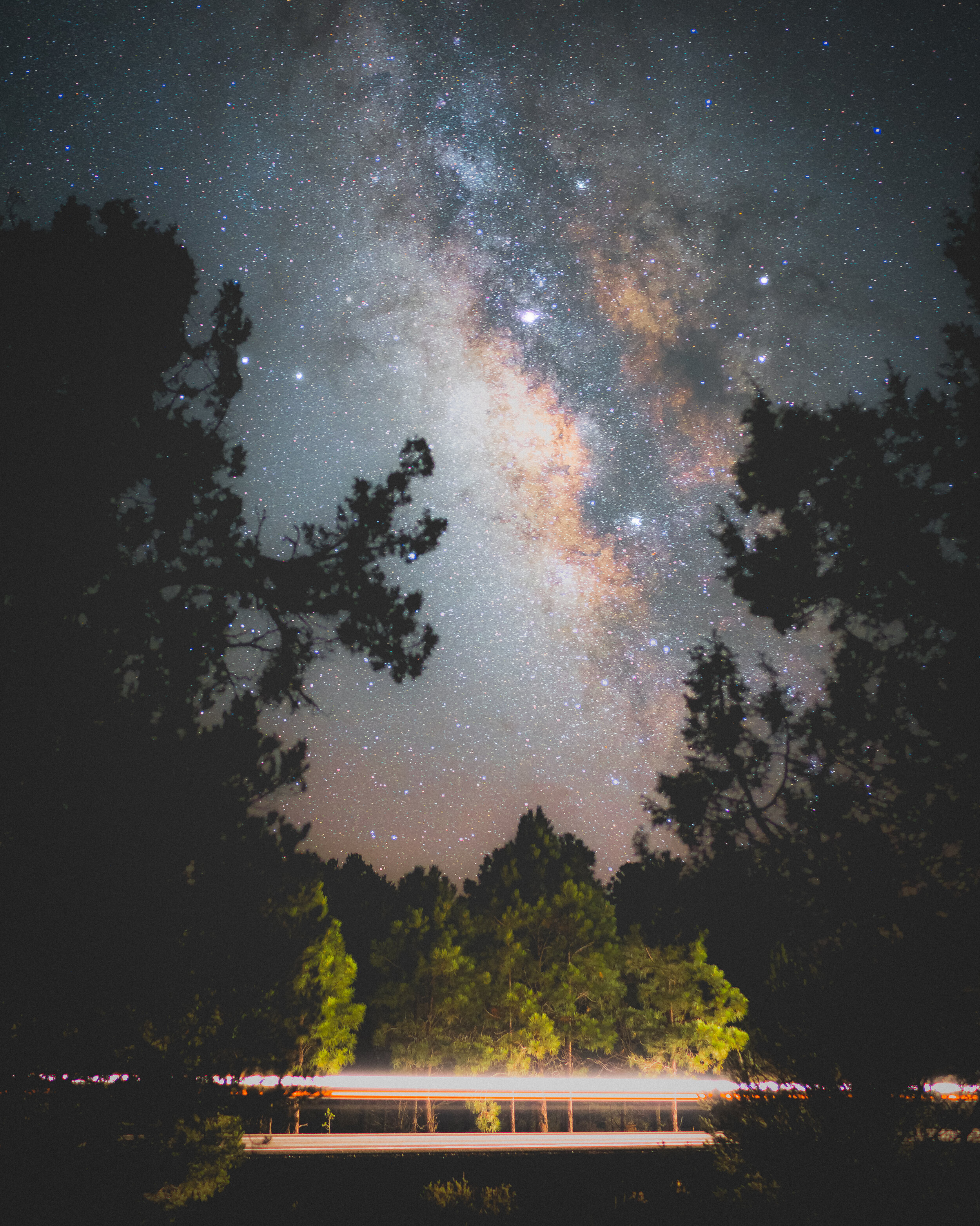
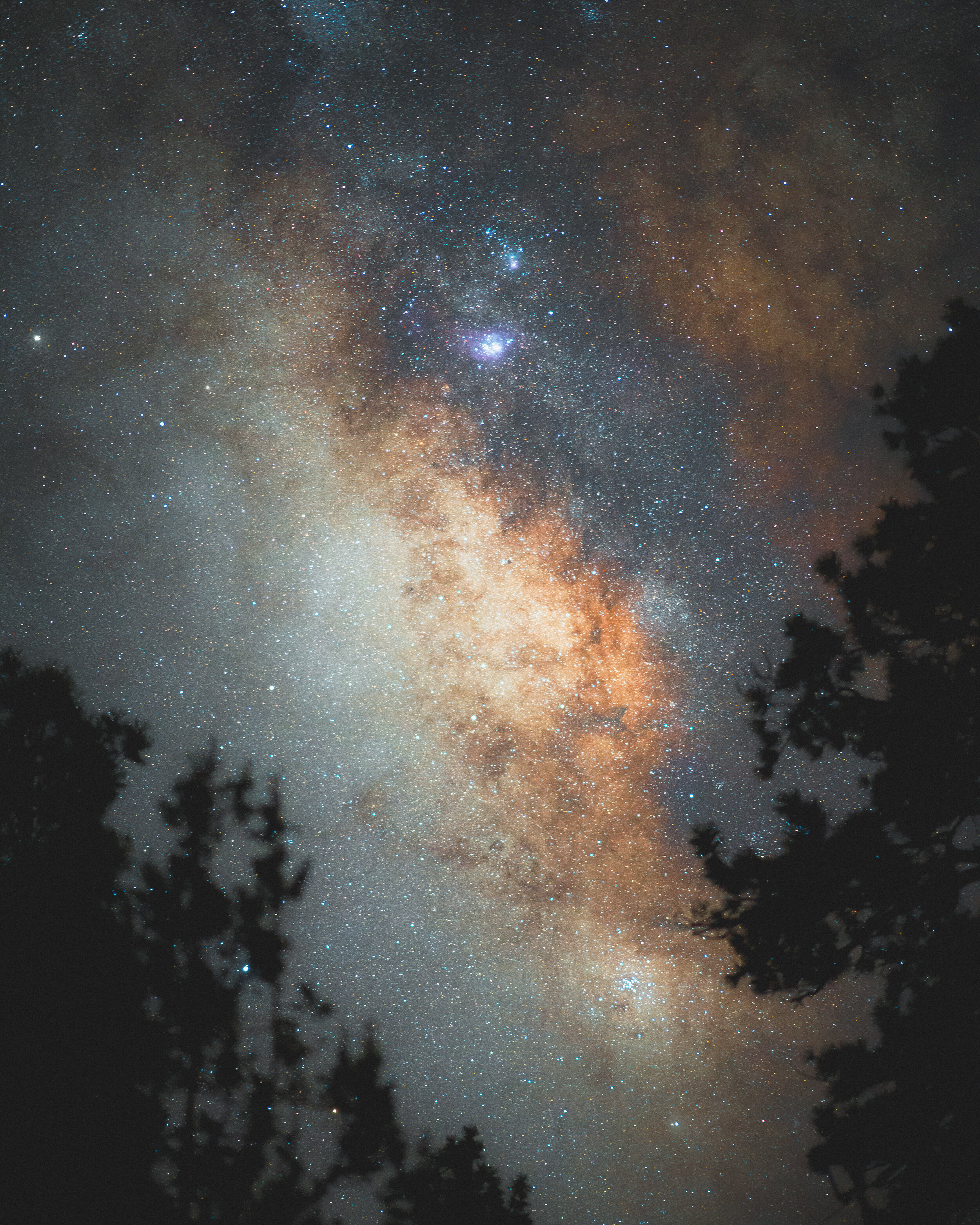
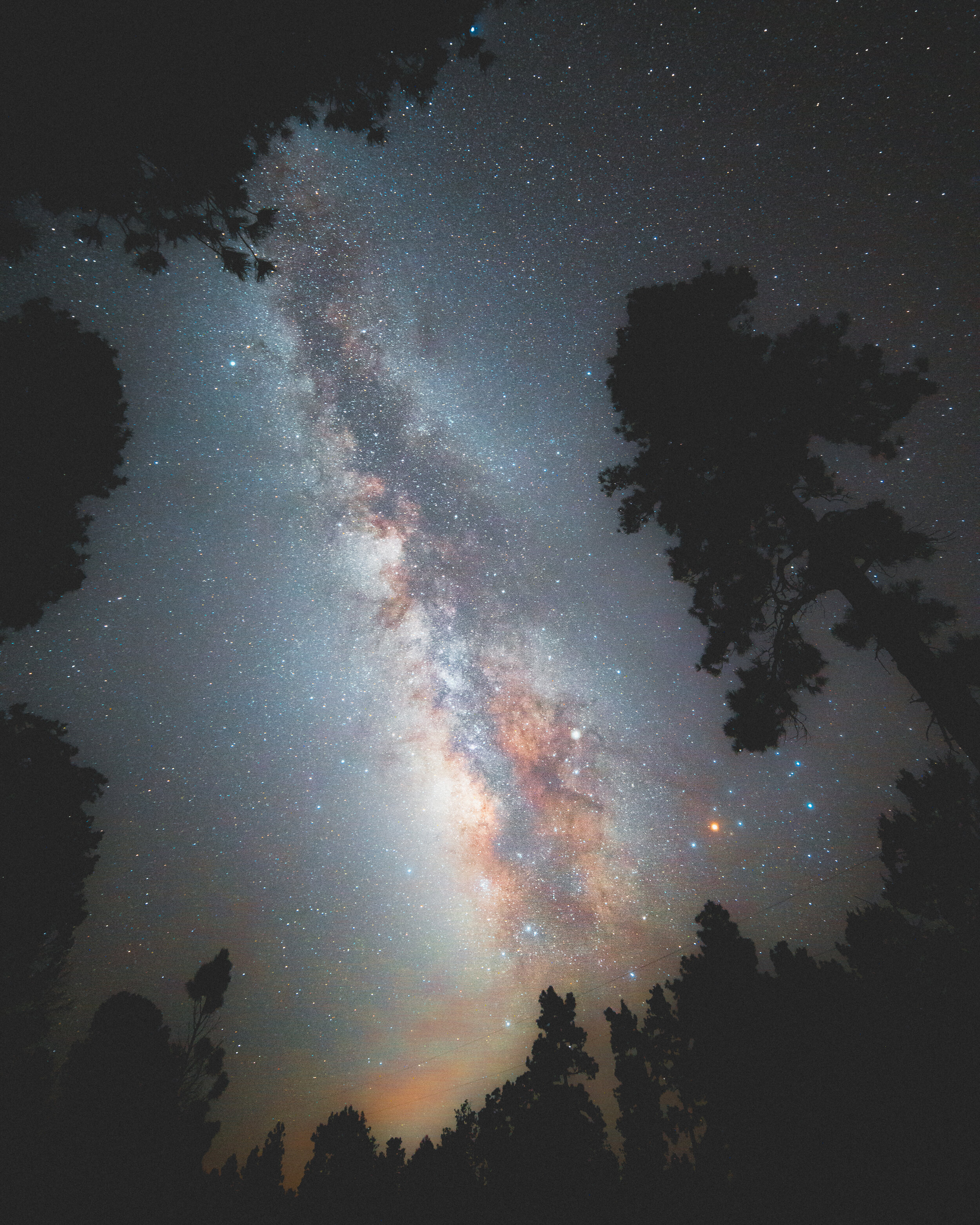
The Core of the Milky Way is by far one of my favourite things to capture with my camera, and even though you can get amazing results right there and then, it takes some post-processing work to get all those nice details and colours to stand out. I have been photographing the milky way for several years now, and I have had a few people ask me how I process the pictures, so here goes - my first ever tutorial.
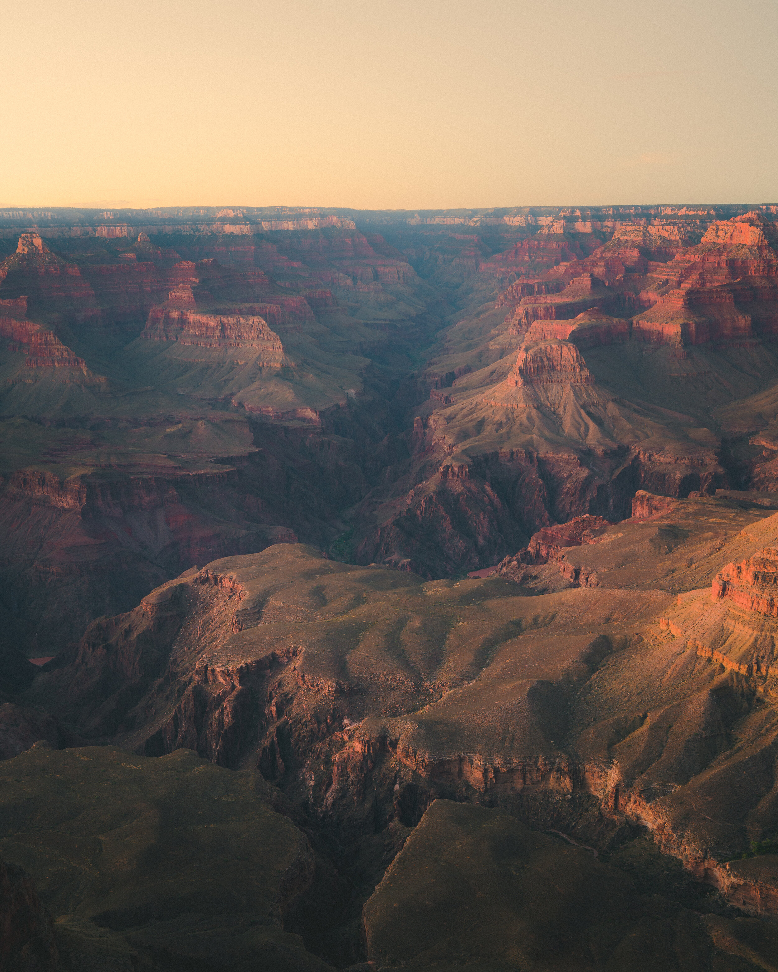
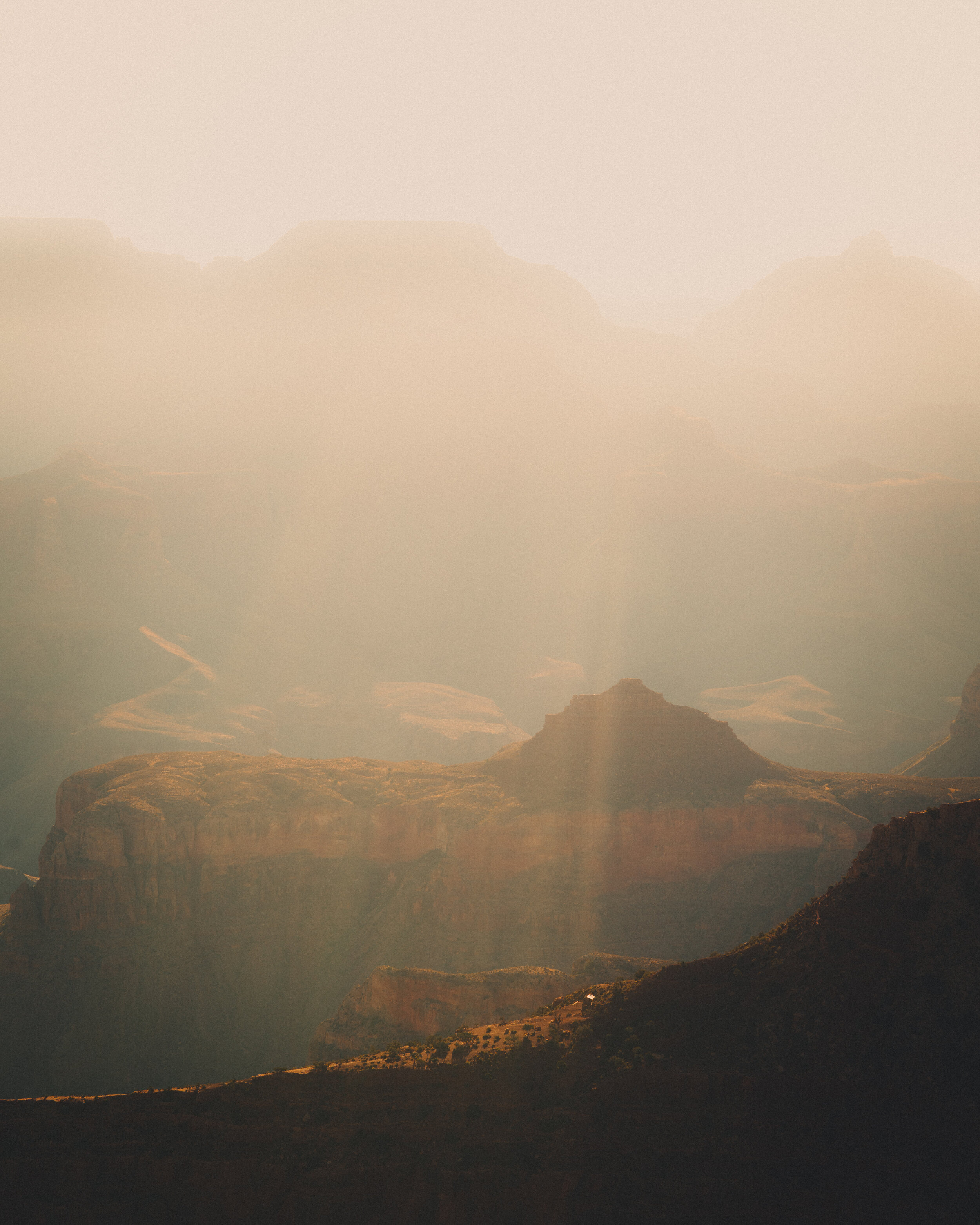
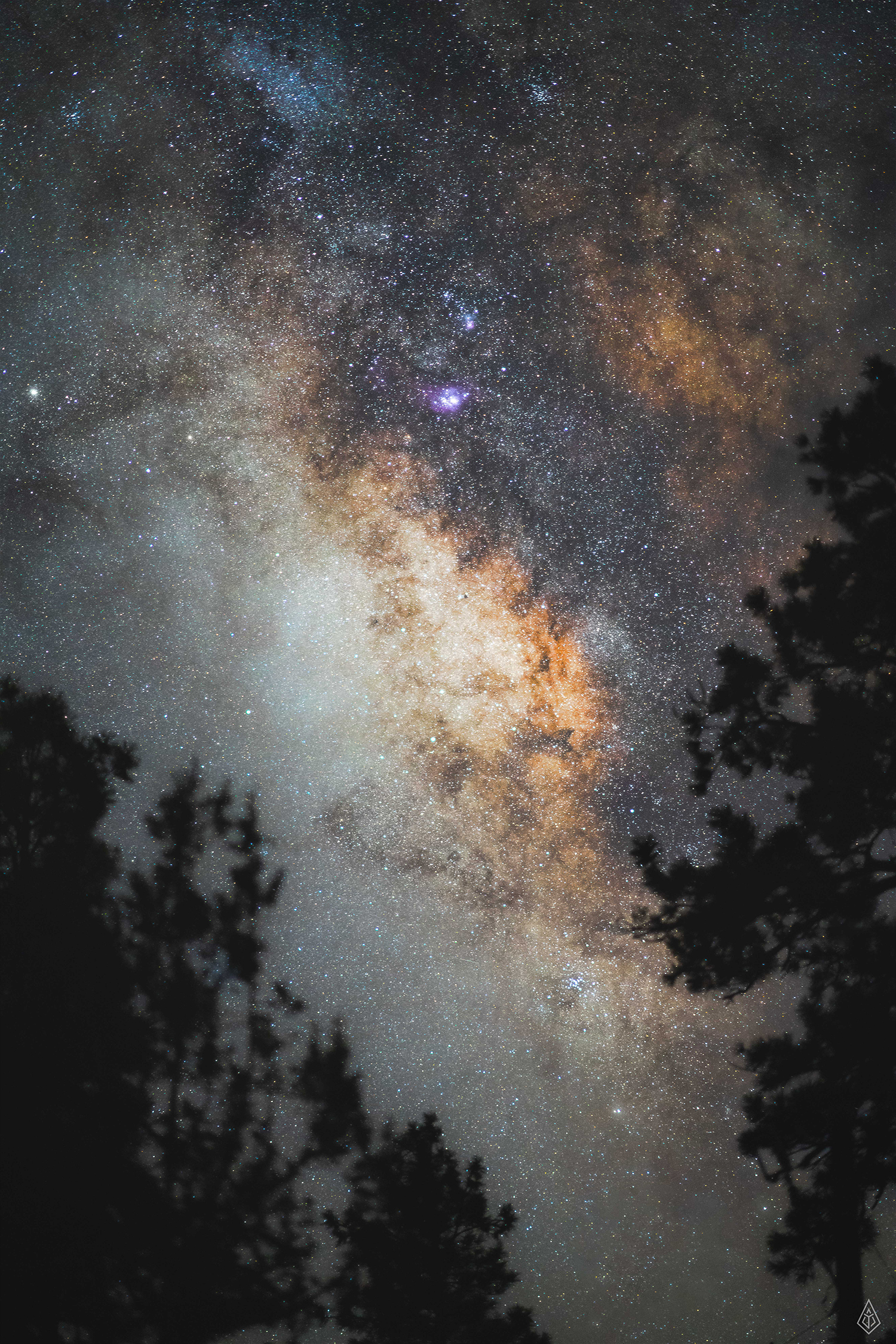
I will be going through a (somewhat untraditional) Milky Way picture I photographed in Grand Canyon National Park in 2017 with a Sony A7R II and Sony FE 85mm F1.4. You can capture the milky way at pretty much any focal length as long as the camera has a decent sized sensor, but the closer you get, the shorter the shutter speed you can use without having the stars turn into trails because of the movement of the Earth. Therefore this photo is shot at 6 sec, F1.4 iso12800. I would suggest looking up the rule of 500 as well as the NPF rule before going out and shooting.
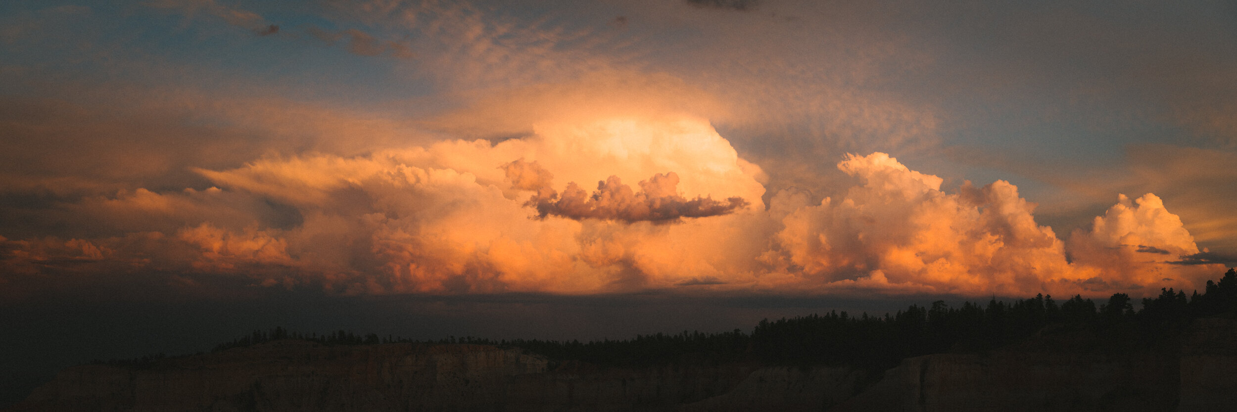
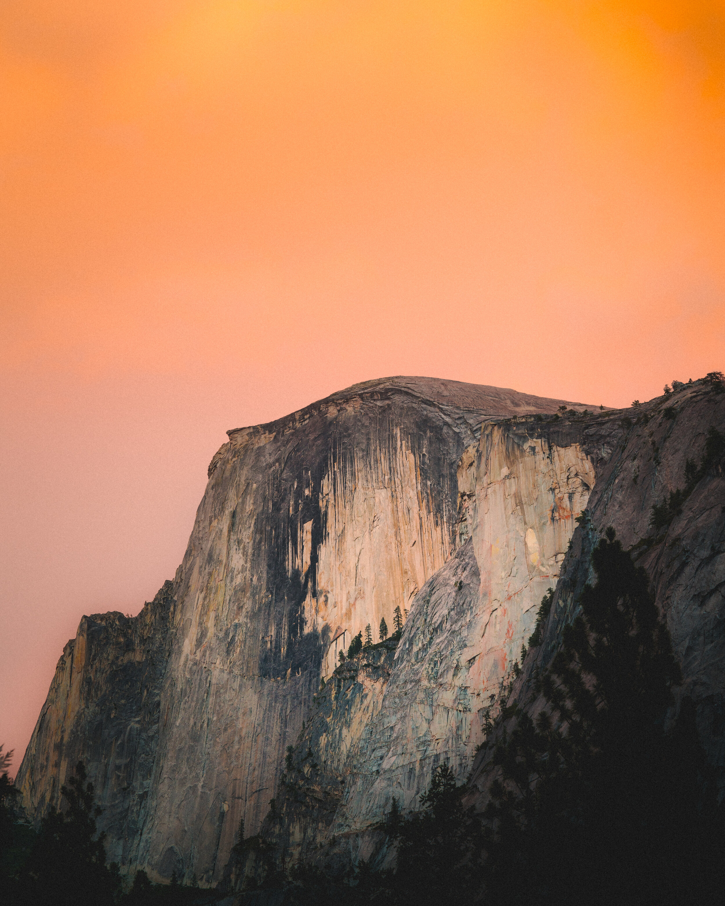
Another aspect that is absolute key to capturing the core of the Milky Way is being the right place at the right time. In the Northern Hemisphere the Milky Way is visible most Summer & Autumn months, and I always plan around this using a light pollution map as well as checking the phase of the moon.

Now I do realize this picture is actually a bit overexposed, and looking back I probably could have gone easy with the ISO, but luckily the RAW-files out of the Sony camera are amazing. I usually start in Lightroom making basic adjustments, as most of the magic happens in Photoshop.
For this picture I brought the exposure down, but usually I would not do that. Other than that it’s pretty standard adjustments - I also sharpened the picture a bit as well as turned on the lens correction to eliminate distortion / vignette.
Finishing up in Lightroom, I use the brush tool to emphasize focus on the core of the Milky Way. It’s a very neat trick shown to me by Donal Boyd and it’s pretty simple: Use a very feathery brush with the clarity at -100 and brush all the areas around the Milky way - this will decrease the contrast and sharpness of those areas, making the picture less cluttered as well as focus the eyes on the core.
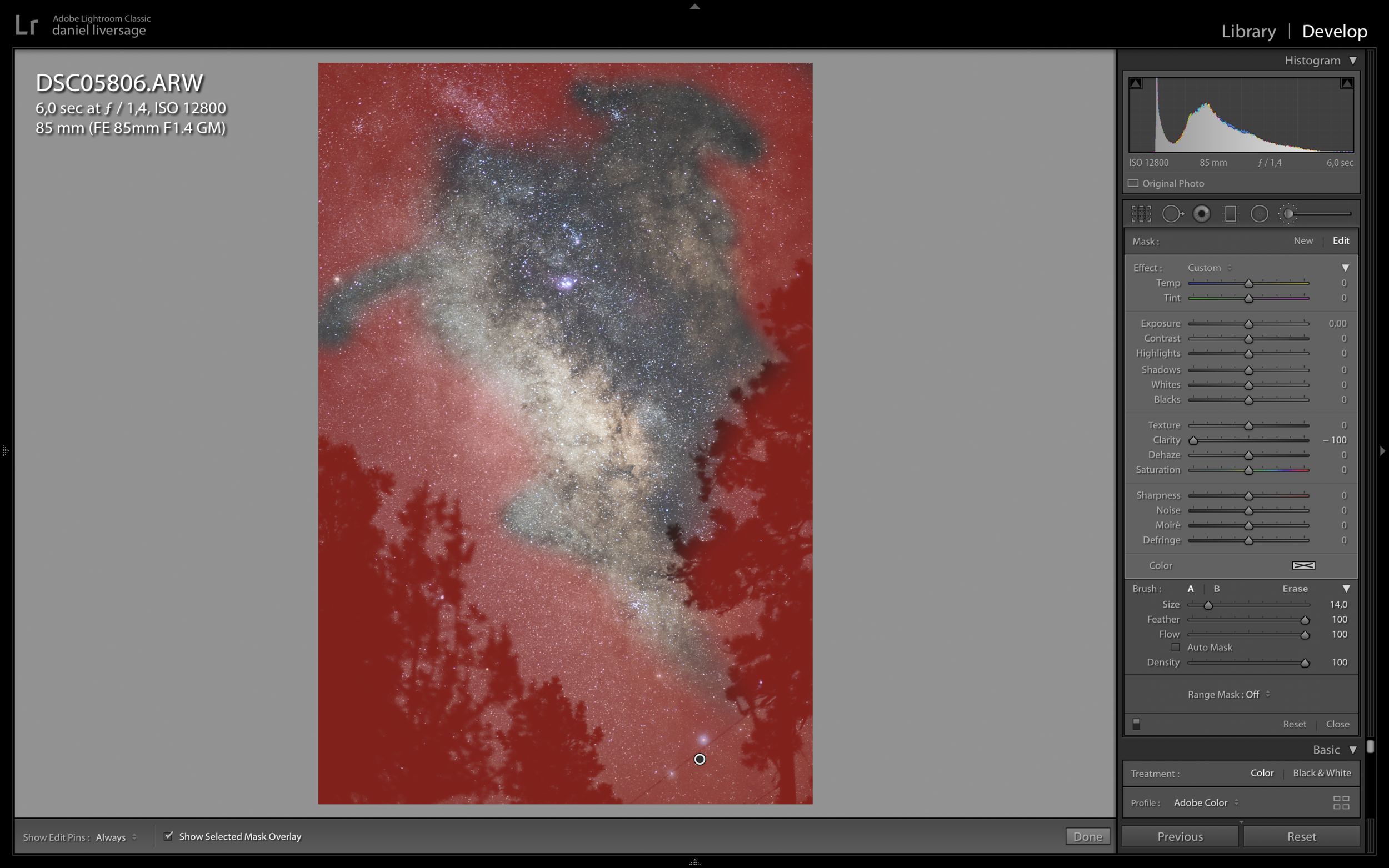

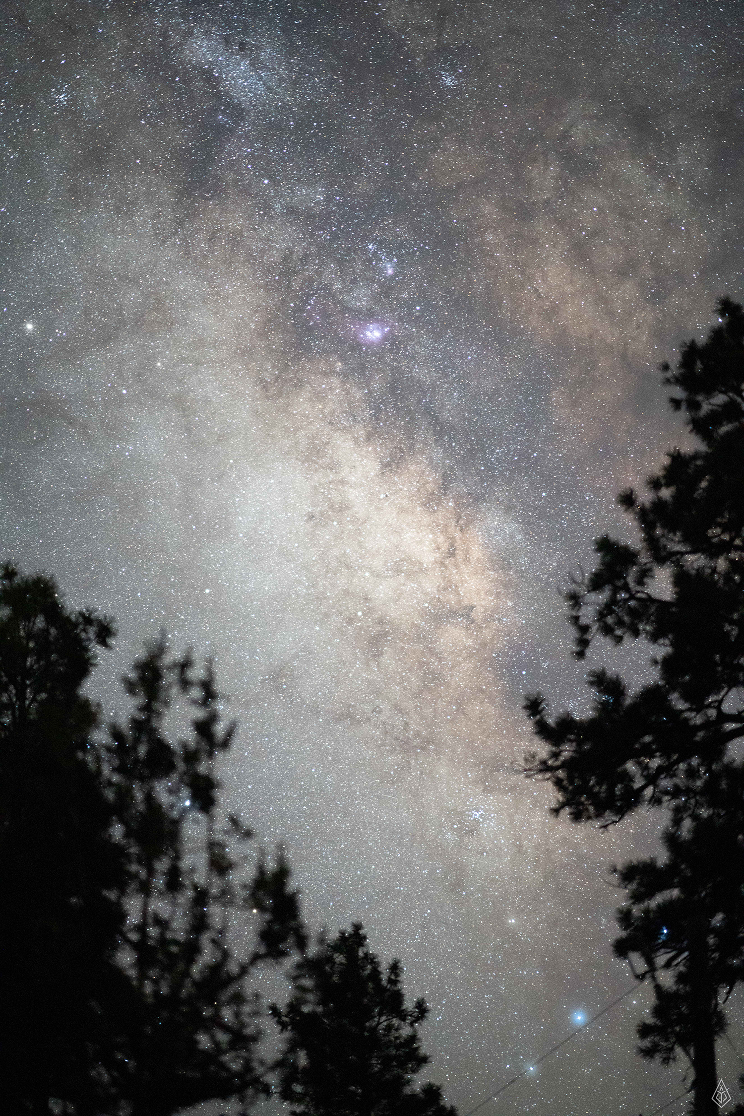
After some pretty quick adjusting in Lightroom I ended up with the picture below - right click the picture and press ‘edit in -> edit in photoshop’ will open up the picture in Photoshop. It doesn’t look like much yet, but now the fun part begins!

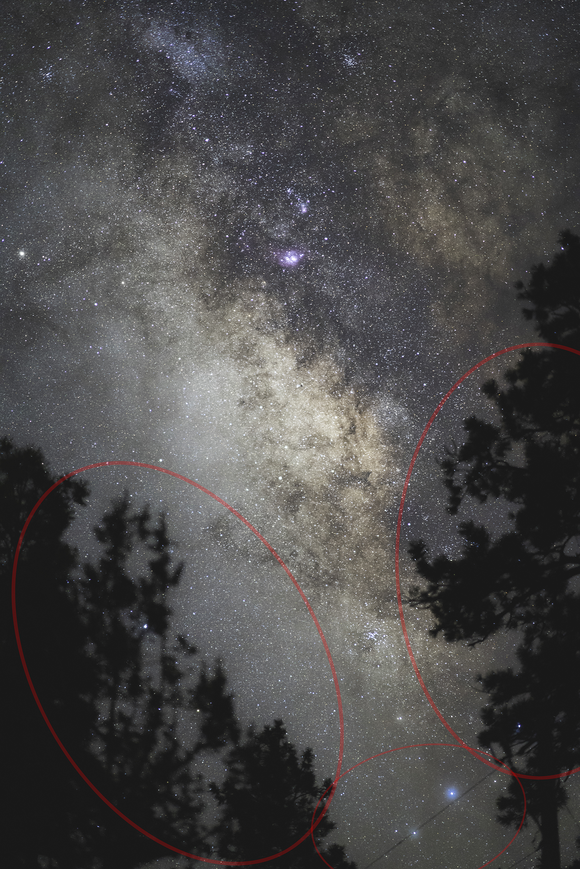
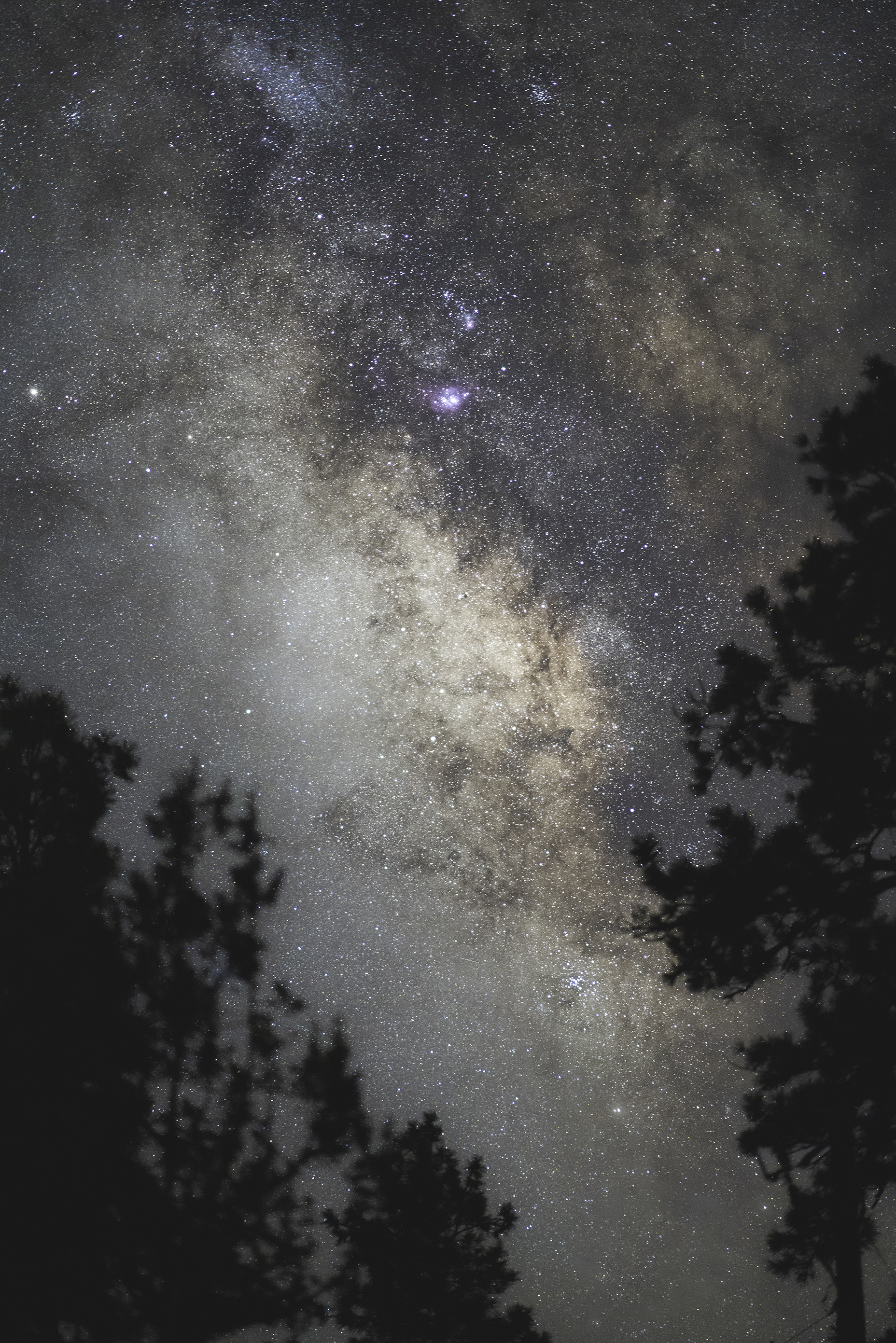
First thing I do in photoshop is using the content aware fill to remove stuff I think is taking up unwanted attention in the picture. It’s easy to spend hours on this, but in this case it’s really just about removing the wires in the bottom as well as some really bright stars popping through the trees - Content aware fill is activated by (shift+f5) and then choosing Content Aware Fill from the dropdown menu - in this case the clone stamp tool would be effective too.
Click the arrow to see before / after.
Now that I have a cleaner picture it’s time to get to work. At this point I use my favourite tool in Photoshop - the colour range tool. With this you are able to create really precise masks, allowing for detailed adjustments without affecting the rest of the picture.
(Select -> Color Range) brings up the tool and from here I use the eyedropper tool to select the orange colours of the milky way. This mask is very subtle, allowing for a clean saturation adjustment of the colours I really want to accentuate.


A +80 saturation adjustment might seem extreme, but as the mask is really subtle the adjustment looks great and not overdone as seen below. One thing that might be necessary in some cases is bringing down the blues as well, as they tend to be affected really easily even though no blues were sampled in your mask.

The next step is Dodging & Burning out the details in the gas clouds - a common technique that I use for all my editing. There are a lot of ways to do this, but I do the following as it is a non-desctrutive technique that allows you to correct if you make any mistakes or overdo it on accident.
For this I create a new layer (CMD+SHIFT+N), set the blend mode to Overlay as well as checking the box to fill the layer with 50% gray - this essentially creates an invisible layer because of the blend mode. Now you can use a subtle brush with either black or white to either darken or lighten the picture - I usually go for a really soft brush with a size of 100-400 pixel (size will vary depending on megapixels on camera) and an opacity of 5-10%.


I brush over the areas I want to accentuate - in this case the darker areas around the orange colour, and don’t worry if you overdo it - you can always go a step back, or even better just lower the opacity of the whole layer - for this I ended up lowering the opacity of the whole layer to 70%. I then added a curves adjustment to increase the contrast - now the picture is starting to look great!

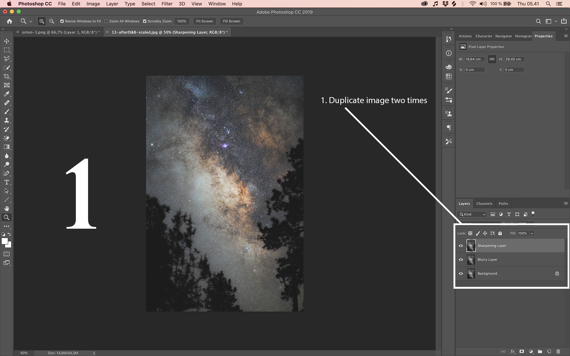
Now the picture is almost finished, and at this point I utilize another very popular editing technique - most commonly known as the Orton Effect.
For this I merge all the layers into one and duplicate it two times - I now have 3 identical layers on top of each other that I'll blend together.
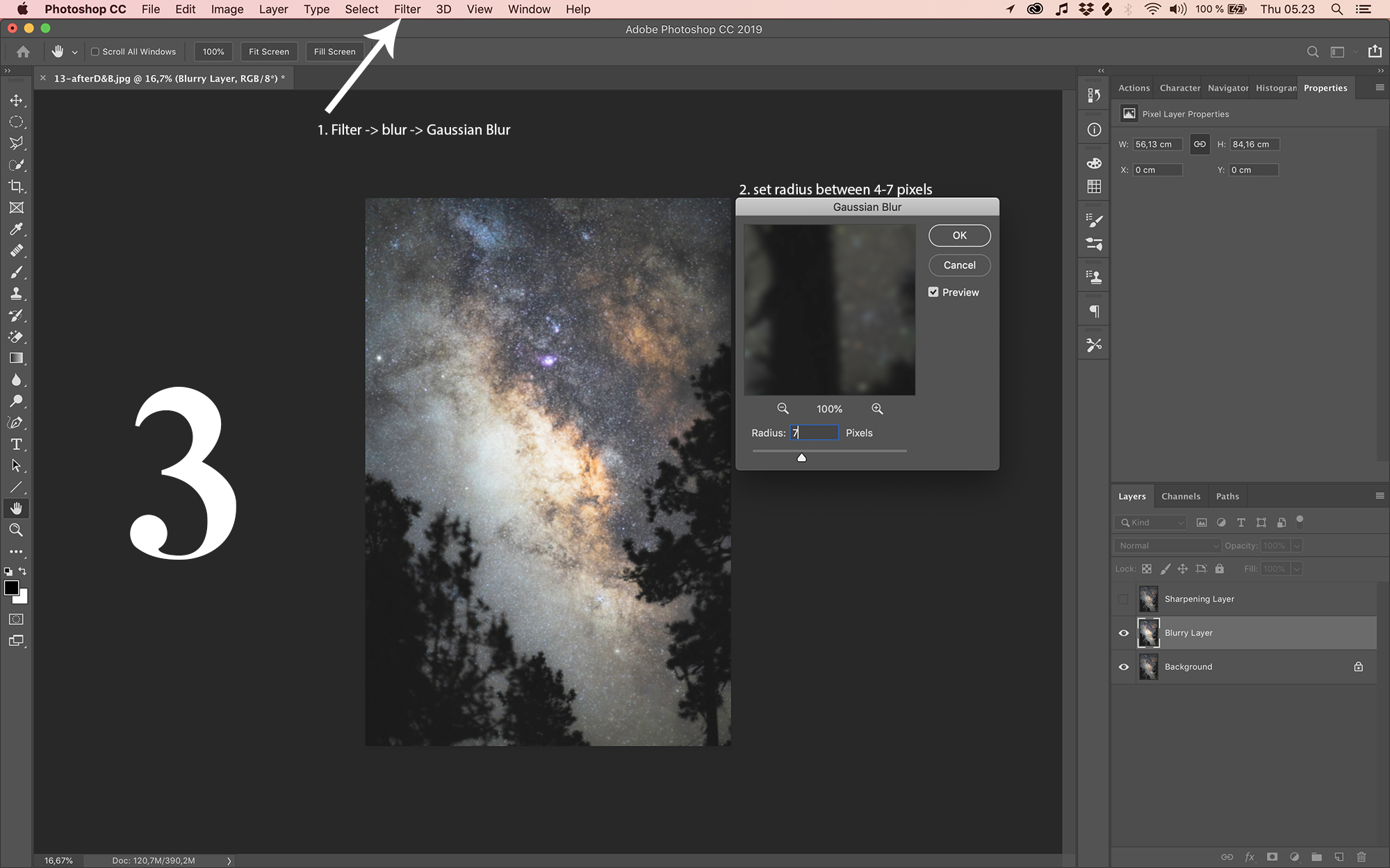
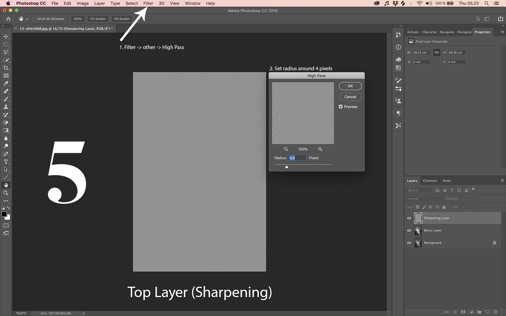
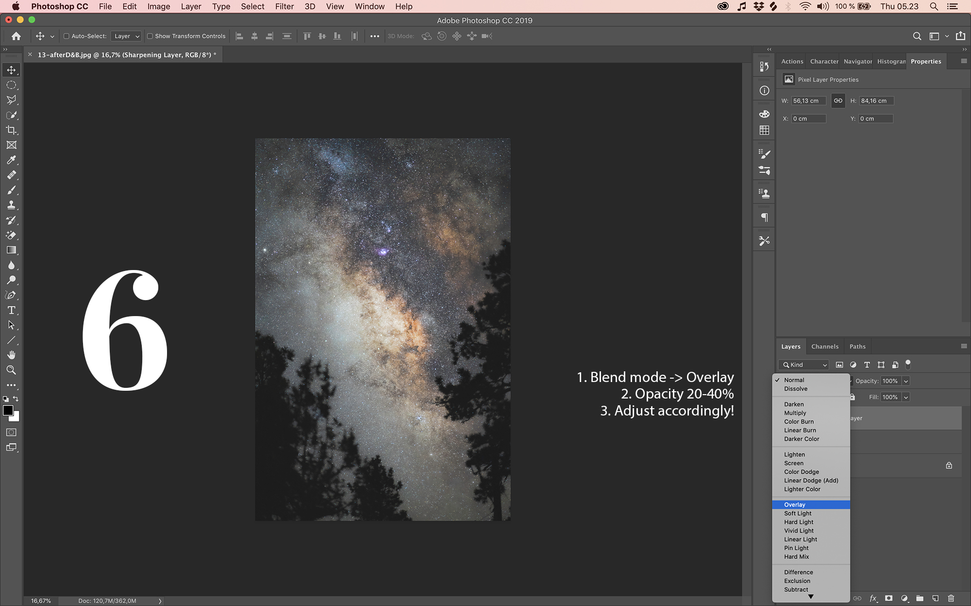
For the layer on top I sharpen the picture using FILTER -> OTHER -> HIGH PASS with a radius of 4px and set the blend mode of the layer to Overlay. This sharpens up the whole image quite a lot so I usually set the opacity somewhere between 20 to 40%.
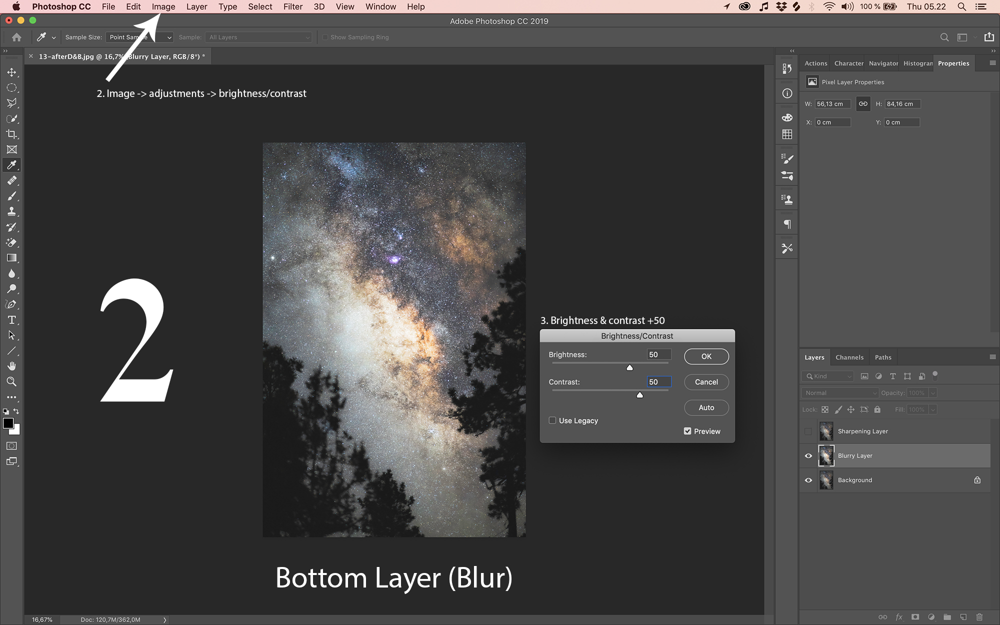
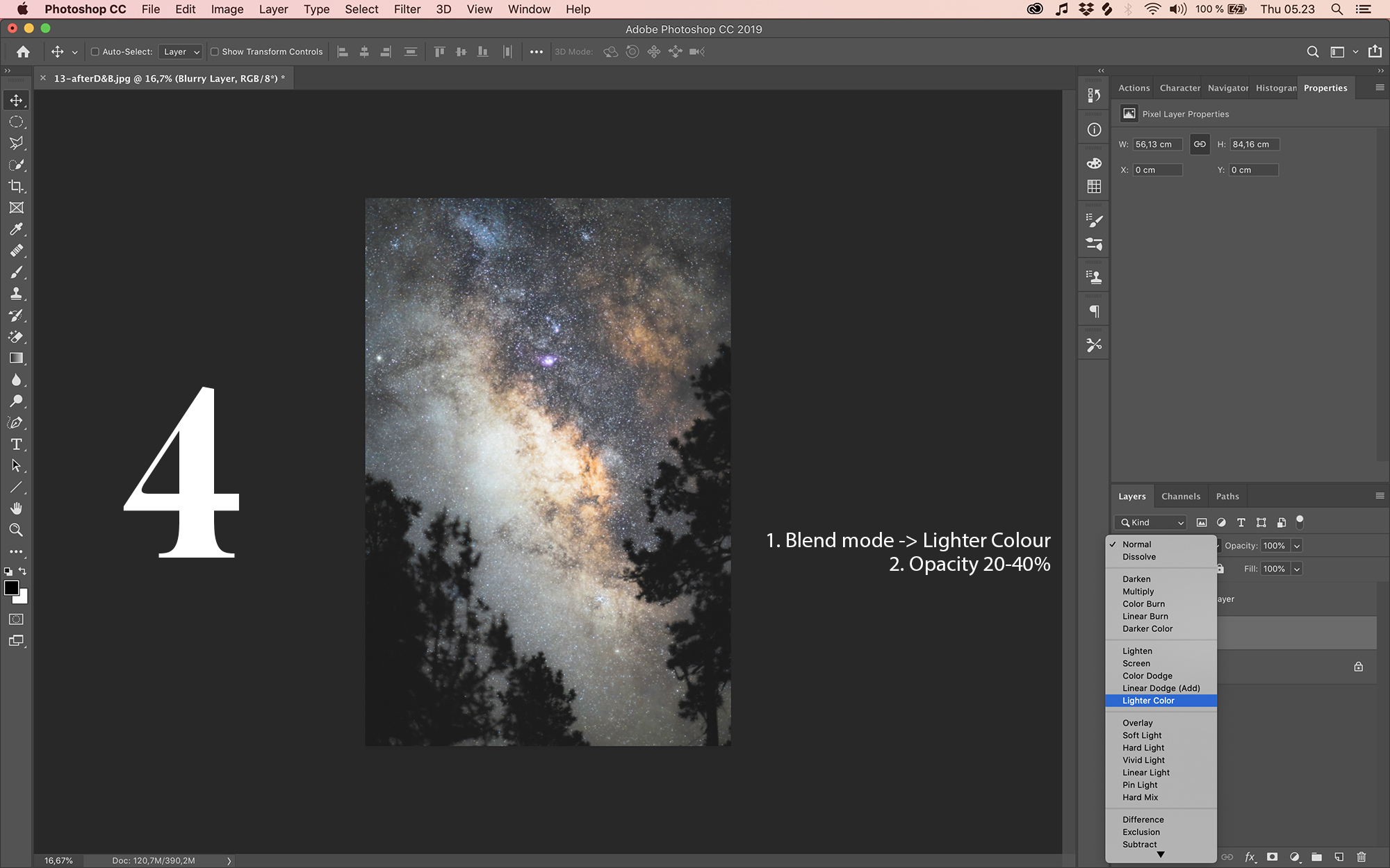
For the layer beneath the sharpening layer (but above the original picture) I do the following: IMAGE -> ADJUSTMENTS -> BRIGHTNESS/CONTRAST and set both to 50. I then go to FILTER -> BLUR -> GAUSSIAN BLUR and set the radius here to 7px. This creates a terribly contrasty, overexposed and blurry picture, but with the blend mode Lighter Colour it blends nicely with the sharpening layer as well as the original picture - for this layer I usually set the opacity somewhere between 20 to 40%. We now end up with this picture, which is almost the final product!
I flatten & save the picture and head back into lightroom for final adjustments - a slight vignette as well as a little contrast boost and this is the final product - use the arrows to show the before / after.
I hope you found this tutorial helpful - feel free to ask me any questions using the contact tab.
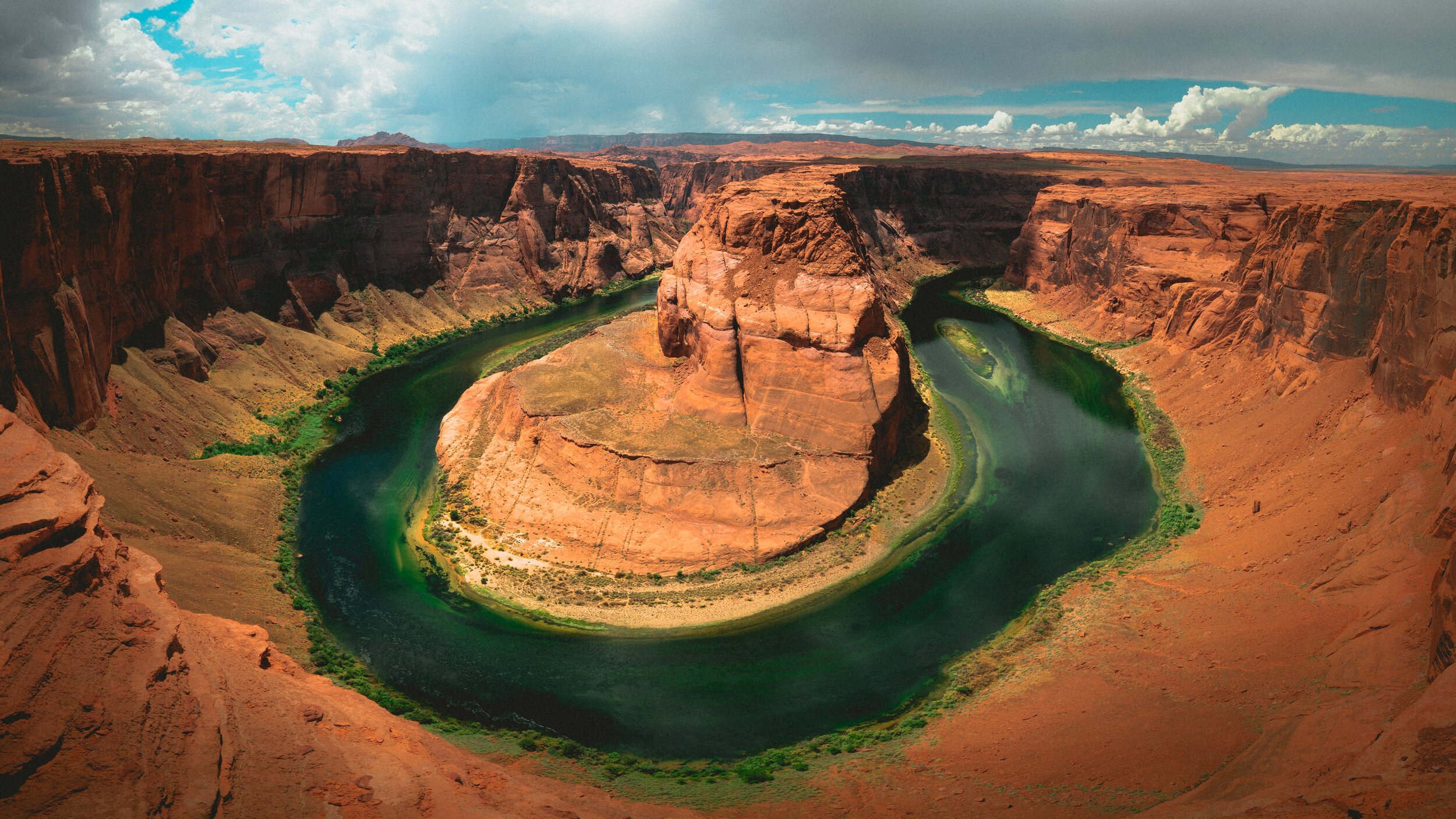
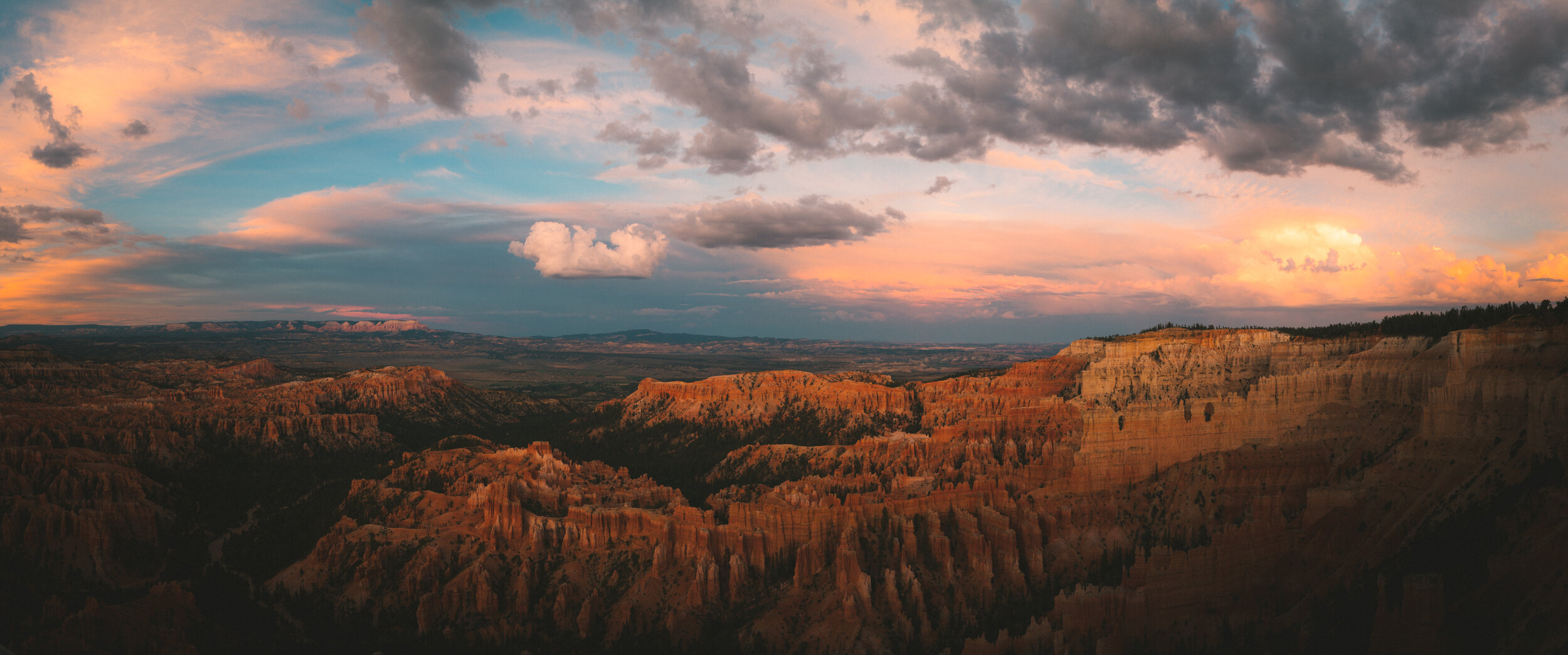
This picture was taken during my trip to USA in 2017 - see more of the images here.